

Key takeaways
- Simplify checkout by enabling guest checkout, removing unnecessary form fields, and testing whether a one-page or multi-step checkout works best for your customers.
- Offer convenient payment options with trusted methods, Shop Pay, and clear shipping costs to reduce checkout friction and unexpected expenses.
- Build customer trust with transparent policies, secure payments, fraud prevention, accessible support, and honest urgency cues.
- Recover lost sales and increase order value through abandoned checkout email sequences, relevant upselling, and complementary product recommendations.
You may put tons of money and effort into designing your ecommerce store. However, if shoppers are unable to make it through to the checkout phase, converting them into paying customers will be next to impossible.
Research shows an average of 70.22% cart abandonment rate, meaning only about three out of ten shoppers who add items to a cart complete their purchase.
As an ecommerce business owner, you don’t have to accept that. By optimizing your checkout page, you can give shoppers all the information they need to make a buying decision and turn them into paying customers.
Read on as we look at ways that can help you optimize your ecommerce checkout page, reduce cart abandonment, and improve conversions.
What is checkout page optimization?
Checkout page optimization means improving the steps customers take to review an order, enter their details, choose delivery, and pay. The goal is to remove unnecessary effort while making costs, policies, and next steps clear.
For Shopify merchants, this includes simplifying fields, offering suitable payment methods, making shipping costs clear early, and using the checkout editor and eligible apps to improve the experience.
Why is checkout page optimization important?
Checkout optimization matters because shoppers abandon purchases when costs, delivery, trust, or the checkout process do not meet their expectations. Baymard's abandonment research reports that, among US shoppers who abandoned for reasons other than simply browsing, 40% cited extra costs, 20% cited slow delivery, 19% did not trust the site with their credit card information, 18% wanted to avoid creating an account, and 17% found checkout too long or complicated.
| Reason | Share of US shoppers | Fix to start with |
|---|---|---|
| Extra costs too high (shipping, tax, fees) | 40% | Show shipping and fees early |
| Delivery too slow | 20% | Show delivery estimates and faster options |
| Did not trust the site with card details | 19% | Use trusted payment methods and clear policies |
| Site required an account | 18% | Enable guest checkout |
| Checkout too long or complicated | 17% | Remove unneeded fields and steps |
These figures show why checkout improvements should go beyond button colors or page design. Clear pricing, reasonable delivery options, guest checkout, and fewer unnecessary fields can address practical reasons shoppers leave. A smoother checkout can also support average order value (AOV) and revenue, particularly when relevant add-ons are presented without disrupting payment.
To measure your results, understand what a good ecommerce conversion rate looks like for your industry and product category. Compare your store’s overall conversion rate with relevant benchmarks, then track checkout completion separately to see whether shoppers are dropping off before payment.
11 ways to optimize your checkout page to reduce cart abandonment
Now that we’ve understood the importance of checkout page optimization, let’s dive right into the various strategies to optimize your checkout page, reduce cart abandonment, and increase conversions:
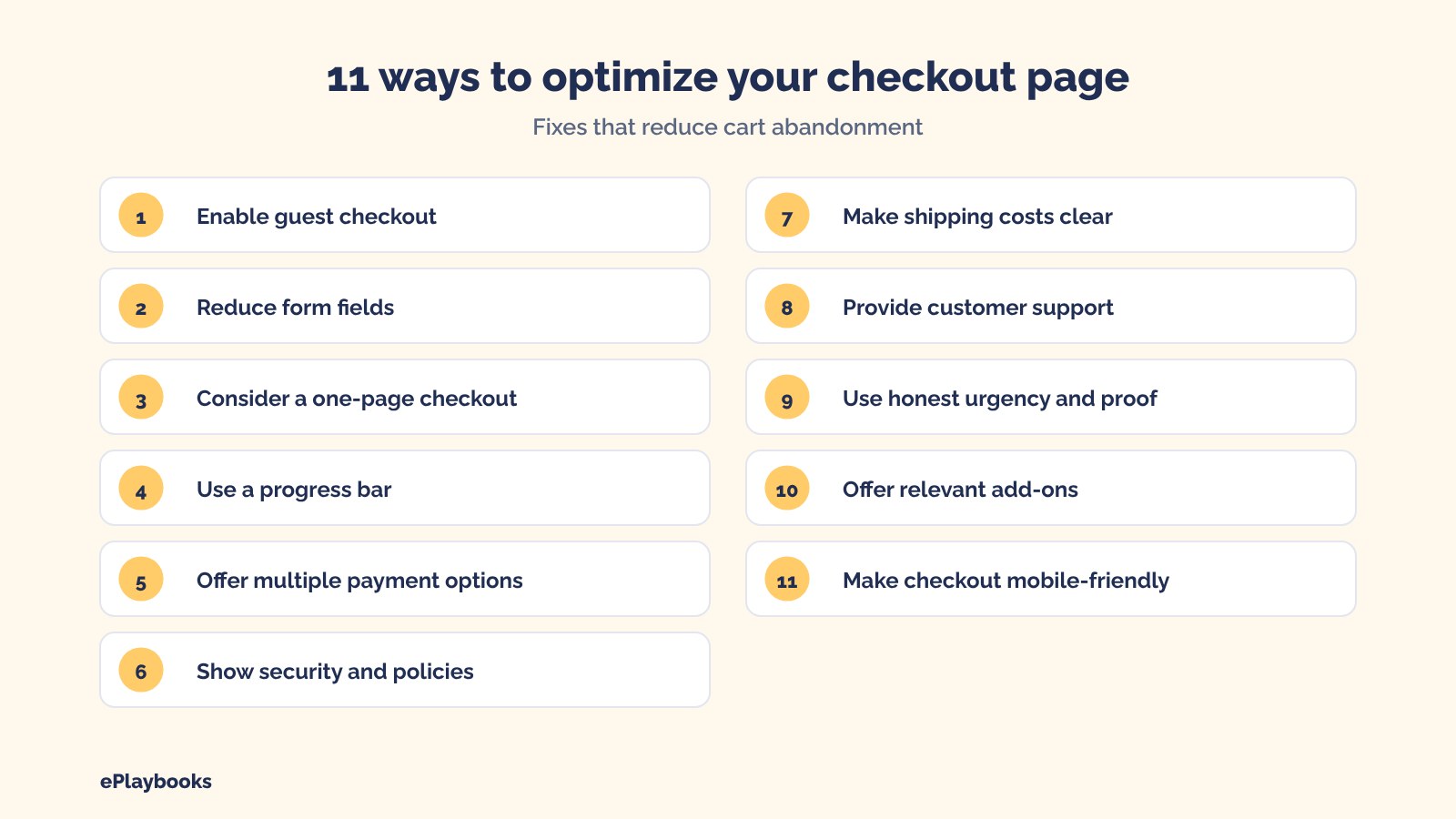
- Enable guest checkout
- Reduce form fields
- Consider a one-page checkout
- Use a progress bar
- Provide multiple payment options
- Build trust with clear security and policy information
- Make shipping costs clear
- Provide customer support
- Use ethical psychological triggers to encourage sales
- Use relevant upselling and cross-selling tactics
- Make your checkout page mobile-responsive
Enable guest checkout
Guest checkout lets customers buy without creating an account, reducing a barrier for first-time shoppers. Baymard reports that 18% of US shoppers who abandoned for reasons other than browsing said the site required them to create an account.
On Shopify, you can review your customer account and checkout settings so account creation does not unnecessarily block a purchase. Let customers check out as guests where your setup allows it, and offer account creation after the order rather than making it a condition of buying. If customer accounts are useful for subscriptions, loyalty, or repeat purchases, explain the benefits without making registration feel compulsory.
Reduce form fields
Reducing unnecessary checkout fields makes the process feel easier and lowers the amount of information customers must enter. According to Baymard's checkout research, most sites need only eight form fields in total for a checkout flow, while the average checkout had 11.3 fields in 2024. The research concluded that showcasing many form fields can discourage shoppers and increase cart abandonment rates.
When creating form fields for your checkout page, ensure it is only for important information. Ask only for information needed to process and deliver the order. Use address autocomplete where available, clearly label required and optional fields, and avoid asking customers to enter the same information twice.
Keep in mind that checkout optimization starts before shoppers reach the payment page. Building a Shopify product page that converts means providing clear product descriptions, accurate pricing, high-quality images, and delivery and return information.
When customers know what to expect before adding an item to their cart, they’re less likely to hesitate at checkout.
Shopify’s Checkout Extensibility and Shop Pay
Shopify merchants can also use Checkout Extensibility to improve the checkout experience. Through the checkout and accounts editor, apps, and extensions, you can customize eligible checkout areas, add informational blocks, and introduce supported features such as relevant offers or custom fields. The available options depend on your Shopify plan and the type of customization. You can also enable Shop Pay to make repeat purchases faster. It securely saves eligible customers’ email, payment, shipping, and billing information so they can check out with fewer steps. Shop Pay availability depends on your payment setup and eligibility. You can offer it alongside other payment methods and test whether it improves checkout completion for your customers.
Consider a one-page checkout
One way you can optimize your checkout process is to use a one-page checkout. You can simplify the checkout process by including all checkout fields on one page.
Multi-checkout pages are great. However, with a one-page checkout, customers can easily access all they need to know on one simple page. This makes the checkout process easier, shorter, and more convenient. Test the checkout on desktop and mobile, and review whether discounts, delivery information, payment methods, and error messages are easy to understand.
Shopify has a one-page checkout as the default layout, so most merchants should focus on simplifying and clarifying that experience rather than trying to add another checkout step. Contact, delivery, shipping, and payment information appear in one continuous checkout flow, with order details available for review. Shopify also allows merchants to switch to a three-page checkout layout. Consider a different layout only when testing shows it works better for your customers. Fewer pages alone do not guarantee a better checkout.
Use a progress bar
A complicated and lengthy checkout process can discourage shoppers from completing their purchases. As we mentioned above, you can consider a one-page checkout page. However, if you already have a multi-step checkout page or you prefer to use it, you can make use of progress bars.
Progress bars can give shoppers an idea of how long the process will take and what steps they will need to take. For example, if you choose Shopify's three-page layout or use another multi-step flow, show a clear indicator such as Contact, Delivery, and Payment. Make sure the indicator accurately reflects the real steps and shows customers where they are in the process. Where possible, allow shoppers to return to earlier steps without losing information.
If your customers can see through the checkout process, they are less likely to abandon their cart along the way.
Provide multiple payment options
Offering payment methods your customers trust helps prevent payment choice from becoming a reason to abandon checkout. Depending on your country, eligibility, and Shopify Payments setup, options may include credit and debit cards, Shop Pay, digital wallets, PayPal, and buy now, pay later services.
Check which payment methods are available to your store and target market, then prioritize the options customers actually use. Explain installment terms clearly where relevant, and avoid cluttering checkout with methods that are unavailable to your customers.
Build trust with clear security and policy information
Customers are more likely to hesitate when they are unsure whether their payment information is safe or what happens after they order. Baymard reports that 19% of US shoppers who abandoned for reasons other than browsing said they did not trust the site with their credit card information.
Use secure, recognizable payment methods and make your shipping, returns, refund, and contact information easy to find. Display trust signals only when they are genuine and relevant; avoid adding a large collection of generic badges that distract from checkout. A clear order summary and transparent policies are often more useful than decorative security graphics alone.
Protecting your store from checkout fraud also helps you create a safer buying experience. Use fraud analysis tools, review suspicious orders, and consider additional verification for high-risk transactions. Balance fraud prevention with a smooth checkout so legitimate customers aren’t unnecessarily blocked from completing their purchases.
Make shipping costs clear
Unexpected shipping costs are a leading reason for cart abandonment. Baymard reports that 40% of US shoppers who abandoned for reasons other than browsing cited extra costs such as shipping, taxes, or fees.
Show shipping rates and other mandatory charges as early as practical, ideally before the customer reaches the final payment action. If you offer free shipping above a threshold, state the threshold clearly and ensure the order total updates accurately. You can build shipping costs into product pricing or set a minimum order value, but make the terms transparent and protect your margins.
Provide customer support
Accessible customer support helps shoppers resolve last-minute questions about product fit, delivery, returns, or payment. Offer a clear contact route, such as live chat, email, or a help page, and make sure it works on mobile as well as desktop.
Answer common checkout questions directly on the page when possible. For example, explain delivery estimates, return eligibility, warranty coverage, or how customers can contact you after ordering. Support should reassure customers without covering checkout fields or interrupting payment.
You can also reduce lost sales by recovering abandoned checkouts with email and SMS sequences. Send timely reminders to customers who leave without completing their purchase, answer common questions, and provide a direct link back to checkout. Test your timing and messaging, and follow applicable email marketing consent requirements.
Use ethical psychological triggers to encourage sales
The process of buying a product is essentially psychological. Many questions go through the minds of customers as they shop on your ecommerce site. Questions like: Is this the right product for me? Should I spend money buying this product? The more ‘Yeses’ you can get in the minds of your customers, the higher your chances of getting a conversion. You can do this by using ethical psychological triggers on your checkout page.
Clear, truthful urgency and relevant social proof can help shoppers make a decision. Use real stock information, accurate shipping cutoffs, verified reviews, and genuine product ratings to answer customers' concerns. Avoid pressure tactics, as this can damage trust.
For example, state a real order cutoff for same-day dispatch only when your fulfillment process can meet it. Do not invent low-stock messages, countdown timers, or limited-time offers. Use reviews and testimonials that reflect actual customer experiences, and keep them close to the products or decisions they help explain.
Use relevant upselling and cross-selling tactics
Relevant product recommendations can increase order value when they complement the customer's purchase and do not make checkout harder. Upselling encourages a customer to choose a higher-value version, while cross-selling suggests a useful complementary item.
For example, a shopper buying lipstick might appreciate a matching lip liner. Keep add-ons optional, explain their value, and avoid sending customers away from checkout or adding items without their clear consent. Track whether offers increase average order value without reducing completed purchases.
Make your checkout page mobile-responsive
Mobile checkout should be easy to read, navigate, and complete with a thumb. Use a responsive layout, readable text, appropriately sized buttons, clear error messages, and payment methods that work smoothly on mobile devices.
Test the full journey on actual phones, including discount codes, address entry, shipping selection, payment, and order confirmation. Remove pop-ups or chat widgets that cover important controls, and check that customers can correct mistakes without re-entering information. Review mobile checkout conversion separately from desktop to find where shoppers drop off.
AI shopping and direct checkout on Shopify
Shopify’s agentic storefront settings let you control how eligible AI shopping channels access your product information and whether customers can check out without leaving the AI experience. Supported options include Microsoft Copilot, Google AI Mode and Gemini, and certain Meta surfaces, depending on availability and eligibility. ChatGPT can also surface eligible products, but shoppers complete their purchase on your own checkout. Check your Shopify admin for the latest options.
The Allow Shopify to manage for me setting is on by default. When enabled, Shopify manages enrollment in available channels and enables direct checkout where supported. To control each channel separately, go to Sales channels > Agentic in your Shopify admin and turn the setting off. You can then manage catalog access and direct checkout for each channel.
Turn it off if you need more control over where your product data appears or how customers buy. For products that require consultations, personalization, custom measurements, or configuration, you may want to send shoppers to your store to complete their purchase.
Keep your product details, availability, shipping information, and return policies accurate across channels. If direct checkout isn’t available or enabled, customers can still discover your products through AI shopping channels but must visit your store to buy. Review each channel’s settings and test the buying experience before enabling it.
What you control and what Shopify controls
You can manage many parts of your checkout, including product details, pricing, shipping and return policies, payment methods, checkout branding, supported app extensions, and AI shopping channel settings.
However, Shopify manages the underlying checkout system, security, updates, and features available on your plan. Some advanced customizations to the information, shipping, and payment pages are only available on Shopify Plus. Other plans still offer standard branding options and some app customizations.
Before changing checkout, identify whether the issue is caused by a store setting, an app, a theme element, a payment provider, or a platform limitation. This helps you focus on solutions you can implement instead of trying to change something Shopify controls.
Final thoughts
Checkout optimization works best when it removes real barriers rather than adding decorative elements. Start with the biggest issues in your data: unexpected costs, slow delivery, account requirements, confusing fields, payment limitations, or mobile usability. Make focused improvements, test the full checkout journey, and monitor completed purchases as well as average order value to understand whether the changes are helping.
Need help improving your Shopify store beyond checkout? ePlaybooks’ Shopify growth services can help you optimize product pages, improve the customer experience, and increase conversions using a data-driven approach.

